One way to visualize the similarity between variables in statistical data analysis is by stacking data points (or dots) in a column, making up what we call a dot plot. Dot plots are similarity matrices used in various applied mathematical and statistical fields to examine the similarities between continuous, univariate, and quantitative data.
It is a histogram-like graph used for relatively small data sets that are made up of various groups of mini-datasets. Although originally hand-drawn in distributions in 1884, the modern version of dot graphs was said to originate from William S. Cleaveland much later.
More information about a dot plot will be shared in this article, including examples and how you can create one to visualize your data using Excel.
What is Dot Plot?
The dot plot is a statistical chart that consists of data points that are vertically illustrated with dot-like markers. It usually takes the form of a bar graph or histogram in the sense that the height of each set of vertical dots is equal to the number of items in that class interval.
Also known as a dot graph, it is used to depict certain data trends in various fields. This graph is plotted by organizing one group of data set on the horizontal axis, and the other on the vertical axis.
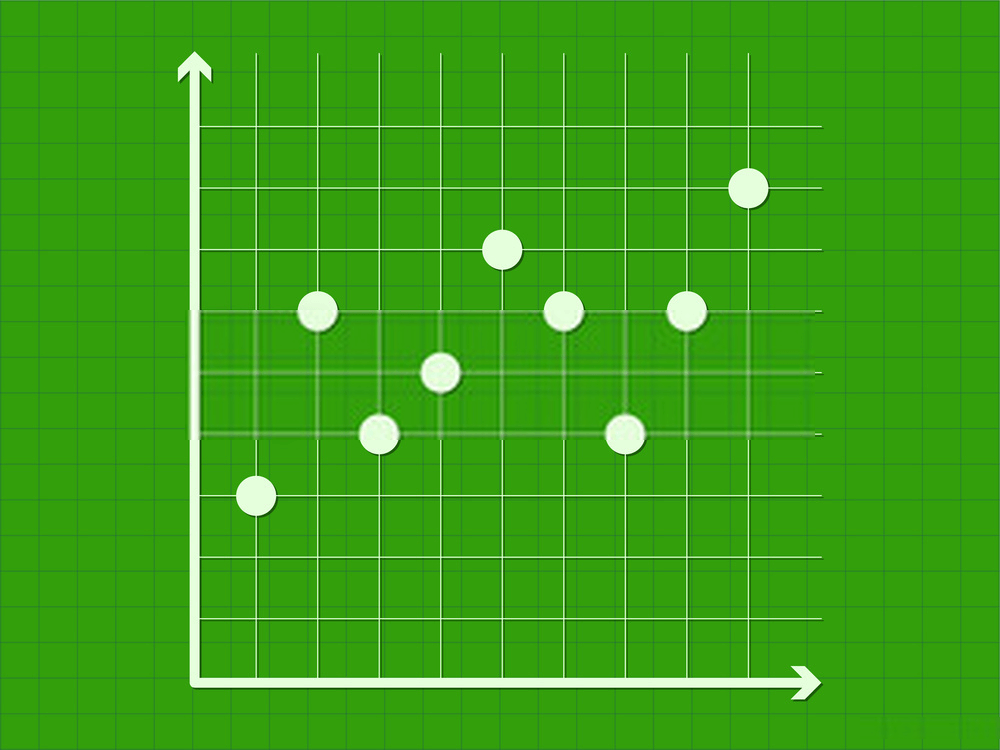
The corresponding data points for each pair of data is indicated with a set of dots drawn directed towards the x-axis. The dots will combine to form a straight line, and this will be repeated for other variables in the dataset.
Types of Dot Plot
Dot plots, just like many other data visualization methods can refer to a variety of graph styles. For the sake of this article, we will be considering 2 prominent types of dot plots, namely; the Cleveland dot plot and the Wilkinson dot plot.
These various graph styles are used in data analysis, but the type used for a particular project depends on the goal of the data analyst.
As the name implies, one thing all these graph styles have in common is that they all contain dots.
The Wilkinson Dot Plot
Named after Leland Wilkinson, its distinct feature is using a local displacement that is perpendicular to the scale in order to prevent the dots from overlapping. At the time of publishing this dot plot algorithm, he was an Adjunct Professor of Statistics from Northwestern University, Evanston.
Although different dot plot variations have been established in the past, Wilkinson’s paper focused on presenting a different algorithm for producing dot plots on a computer. In this paper, he mentioned that the existing programs do not correctly reproduce dot plots.
Instead, they used regular class intervals to produce plots that are similar to the line printer asterisk histograms from way back.
Cleveland Dot Plot
Created by William Cleveland, this is a “scatterplot-like” graph that vertically displays data points in one dimension. It is sometimes said to be similar to a histogram because of its vertical one-dimensional display.
The difference, however, is that unlike histogram which uses length to encode data values, Cleaveland dot plot uses position. Hence, when plotting a dot plot, you don’t necessarily have to start its data axis at the origin and it is flexible for overlaying multiple variables.
Although easily comparable with a bar chart, Cleveland, in 1985, stated that “Instead of histograms, it is better to think of dot plots as horizontal, one-dimensional scatterplots where tied values are perturbed or displayed vertically”. He further broke down graph estimation into 3 parts, namely; discrimination, ranking, and rationing.
Cleveland and Wilkinson also worked together on a book titled, The Grammar of Graphics. This book influenced the creation of Graph Builder.
Dot Plot Examples
Example 1: The table below describes the average number and types of pizzas ordered from a pizza store in a week. Draw a dot plot for the table.

Solution 1: In the digital illustration of a dot graph below, we chose our x-axis data to be Bacon, Cheese, and Pepperoni. The y-axis , on the other hand, was represented by the number of orders received daily.

Example 2: Consider the graph below which represents the pizza orders received from Monday to Wednesday by a small scale restaurant and their prices. Use the graph to determine the mean number of orders received each day.
Also, calculate the median and mode number of orders received daily.

Solution: The mean number of orders received daily can be calculated by counting the number of dots for each day, adding them together, and dividing by 3. So, we have; 5+3+3= 11
112=5.5.
A mode is the highest occurring number. From the dot graph, we observe that 5 orders were received on Monday, 3 orders on Tuesday, and 3 orders on Wednesday.
Since, 3 orders were received on Tuesday and Wednesday, then the most occurring number of orders is 3.
How to Construct a Dot Plot in Excel
Have you ever tried creating a dot plot using Excel in the past but faced some difficulties, then here is where you should be. Although creating dot plots with Excel is not as straightforward as other chart types, you can still hack your way around it through the following steps.
To illustrate how to create a dot plot using Excel, we will be considering the following example.
Example 3: A survey was carried out among women aged 30 to 80 from 10 different cities. The aim of this survey was to find out how many of these women were married, widowed, or divorced. The table below is the result of this survey.

Create a dot plot for this dataset using Excel.
Solution
- Step 1: Enter the data into your Excel worksheet.
- Step 2: Highlight the first two rows of the second, third, and fourth column (i.e. column headings and one row of data except the Cities column). Go to Insert>Charts|Column Chart as shown below. A bar graph will be generated from the dataset.

- Step 3: Right-click on the plot area of the generated graph and click select data. A new dialog box will pop on the screen as shown below.

Click on Edit on the dialog box to edit Series 1 and set the new values to be zeros as shown in the figure below. Click OK in the Edit Series and Select Data dialog boxes. The graph reappears, but now it looks empty.

- Step 4: Add three columns of 1’s (column E). 2’s (column F), and 3’s (column G) to the worksheet as shown in the figure below. We only added 3 columns because we are dealing with three groups.

- Step 5: We right-click on the plot area of the chart, then go to Select Data. this will again bring up a dialog box similar to the one shown earlier. This time, however, we click the Add button, and a dialog box pops up. The series value doesn’t matter at this point, so we click OK and a char is immediately generated.
- Step 6: The next thing is to change this new chart into a dot plot. To do this, right-click on the plot area of the graph and select Change Series Chart Type. A new dialog will pop up as shown in the figure below.

Change the chart type for Series 2 from Clustered Column to Scatter and click OK.
- Step 7: Right click on the plot area once again and click on Select Data. When the dialog pops up, select Series 2 and click on the Edit button. Fill in the dialog box as shown below.

- Step 8: Add a new series by going to Series Data like it was done in previous steps. This new series will be automatically considered as a scatter plot type, so you need not change the plot type. Fill the dialog box with the relevant data as shown below.

Repeat step 8 for the third series, and there you have your dot plot.

In a dot plot, data points (dots) are stacked in a column over a category. The height of the column represents the frequency of observations in a given category. In the dot plot above, the categories are Married, Divorced, and Widowed.
It can be seen that the dot plots are overlapping. This is due to the nature of the data and the scale used for plotting the dot plot. The vertical scale is 1:100.
We can further increase the scale to avoid overlapping of data points.
More Data Visualization Tools For Dot Plot (SPSS)
Now that you can create your own dot plot using Excel it’ll be great to add that SPSS is also another amazing tool for creating dot plots. In fact, SPSS allows you to create dot plots faster than Excel.
An abbreviation for Statistical Packages for Social Sciences, it is very easy to use and in just a few steps, you can create a dot plot. Unlike in Excel, Dot Plots are available in the SPSS graph menu.
Follow these simple steps to create a dot plot using SPSS.
- Enter your data into the SPSS workspace.
- Go to Graphs > Chart Builder > Gallery > Scatter/Dot. Click on Simple Dot Plot from the graphical list. After clicking on Simple Dot Plot, eight different scatter/dot plots will be presented in the lower middle part of the dialog box. Select one of these visual representations.
- You will be presented with a preview pane that looks like a dot plot. Here is where you can drag and drop the values for the x and y-axis.
- Make further edits to your dot plot in the Chart Builder and view the changes in real-time in the preview section.
- Click on OK and the Chart Builder will generate the dot plot.
Benefits of Collecting Dot Plot Data with Formplus
In order to arrive make correct influences from your dot plot, you need a tool that collects error-free and efficient data through an optimized process like Formplus. Beyond collecting data, Formplus also provides you with a range of features that assist in the entire data analysis process.
- Time-Saving
Carrying out a survey for your dot plot data then you can save most of the time spent distributing your surveys and looking for respondents with the Formplus sharing options. This feature allows you to simultaneously share your survey on multiple channels and get multiple responses without lifting a finger.
With just one click you can share your survey on your social media pages including Facebook, Twitter Instagram LinkedIn, etc. You can also embed the survey on your website with this feature.
- Cost-Efficient
Save the cost spent on printing and paying people to go out and distribute your paper surveys with online forms. You don’t need to employ people to distribute your surveys or help you sort out the stack of papers featuring responses to your survey.
The only man-power you need to sort out your data is Formplus which means “no manpower” at all. Formplus analytics & reports give you an insight into your data at a glance properly sorts your data into tables, and also gives a detailed report about the responses.
- Increased Data Efficiency
Human beings are naturally prone to making mistakes which means that you can’t be certain of the efficiency of your data when collected manually. Formplus provides a digital solution that collects error-free data and promises a 100%+ data efficiency.
Therefore, eliminating the possibility of making wrong inferences from your final data plot due to faulty data. You can also eliminate issues that may arise from the response and no response biases by adding response validations to your form fields.
- Flexibility
Formplus gives you the freedom to choose how you want your survey to look. You can either choose one of the many ready-to-use Formplus templates or create your own survey from scratch using the form builder.
This freedom is also extended to institutions collecting data plot data for commercial purposes. You can add your institution logo background image color, font, or use the CSS feature to create more flexible custom surveys.
- Collaborate With Teams
Do you have a team of individuals working together with you to create the dot plot? Then we are glad to inform you that collaborating with them has been made easier with the Formplus Teams & Collaboration feature.
This feature allows you to add your team members to your account so they can easily make real-time contributions to your data collection process. You can also assign roles and permissions to each team member to ensure that each member is strictly faced with his or her responsibilities.
Uses of Dot Plot
- Bioinformatics
In 1970 Gibbs and Mclntyre introduced the use of dot plot for visualizing the similarity between 2 nucleic acid sequences (protein). The proteins are usually compared along the x and y axes.
From our knowledge of graphs in mathematical science we know that identical proteins will make a diagonal from the dots. So, the residues or lone dots are shaded for easy identification.
- Financial Institutions
The U.S. Federal Reserve (Fed) uses dot plots to convey interest-rate projection on Federal Funds at a number of Federal Open Market Committee meetings. The members of this committee place dots on the dot graph to denote their future interest rate projections.
- Research
Dot plots are used when conducting research that involves studying the similarities between one or more variables. The inference made from analyzing data using dot plots can help in predicting trends and providing applicable solutions.
Advantages of Dot Plots
- They are an efficient way of representing frequencies and proportions.
- They are more detailed because they showcase density distribution and outliers in data points.
- You can add more data density to dot plots by making use of od color and size, giving rise to what we call bubble dots.
- They can be used to tell a beautiful story by adding colorful dots.
- They can be used to represent up to a thousand data points. Although it gets cluttered and an eyesore as the number grows larger there is a hack around this.
Disadvantages of Dot Plots
- It can be time-consuming to construct when dealing with a large data set.
- Getting the frequency of a dataset from the dot plot is usually difficult. The data will have to be counted one by one, which may not be feasible when dealing with a large frequency.
- Not good for large datasets because the points become cluttered and eventually difficult to read.
Conclusion
Dot plots are great for visualizing the distribution of quantitative variables, with each dot representing a value. When dealing with values that have a frequency that is greater than one, the dots are vertically stacked over one another such that the collective height of the dots is equivalent to the frequency of that value.
Although a little bit demanding when created using Excel, dot plots are one of the simplest statistical graphs. They are used for highlighting gaps, clusters, and skews in distributions of small data sets.
When used for a large set of data the dot plot will become overcrowded, making it difficult to read. In situations like this, it is advised to use charts like a histogram or bar chart.