Data visualization is an important aspect of data analysis, and one of the simplest methods of visualizing data is through a line graph or chart. This is partly because, for a lot of people, drawing out strokes or simple lines is quite easy to do and also not hard to interpret.
That is why, when teaching children how to write, for example, it is done with a special writing book which is divided into lines. These lines are what guide a child's writing, and are quite easy to follow until the writing is perfected.
Beyond serving as writing guides, lines are often being used in experimental sciences to visualize data, and are called line charts. In this article, we will be defining a line chart, identifying its types, highlighting examples, and explaining how it can be created using Excel.
What is a Line Graph?
A line graph is a kind of graph that contains two or more individual data points connected by lines. These individual data points represent a series of information, which usually explains the relationship between the two axes (i.e. the x and y-axis) on the graph.
Also known as a line chart, it can tilt towards the positive y-axis (go up), approach the negative y-axis (go down) or as depending on. That is, a line graph can ascend, descend, or do both depending on the kind of data that is being evaluated.
For example, when studying the relationship between price and demand, the line graph will descend while it will ascend when studying the relationship between price and supply. The purpose of a line graph is to create a visual representation of the relationship between two different things.
Features of a Line Graph
For a graph to be called a line graph, there are 5 main characteristics it must possess. These 5 main features are the title, scale, points, labels, and line.
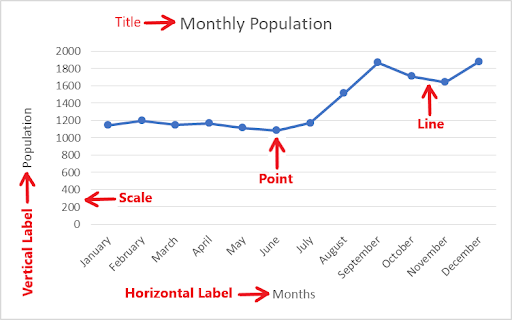
To better explain these features, let us consider the graph below which illustrates the population of a particular community over a year.
Title
The title of a line graph is what tells you what the graph is about. Just like the title of a book, an article, or a blog post, it gives a brief description of the graph.
With the title of a line graph, you get an insight into what the graph entails, what kind of data the graph is visualizing, and the kind of conclusion you should be looking at when viewing the graph. That way, even before taking a proper look at the graph, you already know what to expect.
There are different approaches to writing a graph title, but some key things should be taken note of. When writing a graph title, it should:
- be brief,
- give a proper explanation of the graph, and
- have catchy phrases.
Scale
The scale of the graph explains the number of units used in defining each point on the graph. It is very important, as it will assist the third party in correctly interpreting the graph.
Graphs are usually manually constructed on paper, using Excel, or automatically generated with software. In some cases, the kind of data being evaluated is either very large or has a different unit of measurement.
Therefore, you have to generate a scale for the data, in order to properly visualize it on the graph. In the graph above, the difference between each point on the vertical axis is 200.
Therefore, the vertical scale can be defined as “1 unit is 200 people”.
Points
Also known as the data points, this is what depicts the value of each data on the graph. Multiple data points indicate various statistics over time.
The graph above, for instance, shows the population of a particular community over a period of time with the data points indicating the population size at a certain time.
Data points can also be visualized using markers as opposed to dots.
Labels
Each axis on a line graph has a label that indicates what kind of data is represented in the graph. The X-axis describes the data points on the line and the y-axis shows the numeric value for each point on the line.
We have 2 types of labels namely; the horizontal label and the vertical label. The horizontal label defines the data that is being described on the x-axis, while the vertical label defines the kind of data that is being described on the y-axis.
With the label on the above graph, we can clearly determine that the Months are on the horizontal axis and the Populations are on the vertical axis.
Line
The line gives an estimate of the values between each point in discrete functions, while it gives the actual data in continuous functions. We may also say that the line is the actual graph, while the other parts of the graph are just guides that will help you understand the line.
A line is generated by joining the points on a graph together. When constructing a line graph, the points are joined together using a straight line.
With a line on a graph, you can determine the behavior of the data at a glance
Types of Line Graphs
There are 3 main types of line graphs in statistics namely, a simple line graph, a multiple line graph, and a compound line graph. Each of these graph types has different uses depending on the kind of data that is being evaluated.
Simple Line Graph
A simple line graph is a kind of graph that is plotted with only a single line. Like in the diagram above, shows the relationship between two variables.
In most cases, one of these variables is independent, while the other is a dependent variable. The independent variable is usually time, but it can also be any other factor.
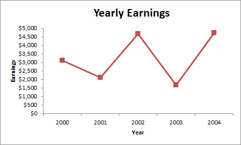
In the example illustrated above Earnings is the dependent variable while the Year is the independent variable. This illustration indicates the yearly earnings of an individual over a 5-year period.
Multiple Line Graph
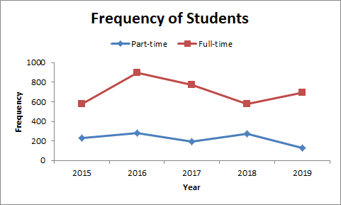
A multiple line graph is a line graph that is plotted with two or more lines. It is used to depict two or more variables that change over the same period of time.
The independent variable is usually on the horizontal axis, while the 2 or more dependent variables are on the vertical axis. For example, if you want to compare the population of full-time and part-time students in a school over a couple of years, you need to visualize it using a multiple line graph.
Compound Line Graph
This type of chart is used when information can be subdivided into different types. It is a development on the simple line graph which shows the total data proportion and the different layers that make up the data.
When constructing a compound line chart, you need to first construct multiple line graphs, then shade each part to indicate the component of each data from the total. Each of the bottom lines indicates a part of the total, while the top line is the total.
On a compound line graph, the distance between every 2 consecutive lines shows the size of each part, with the bottom line being bounded by the origin.
How to Create a Line Graph Using Excel
Excel is a great tool for data visualization that can automatically convert your data into a line chart. Therefore, in order to accurately visualize your data in a short time, we will be guiding you on how to create a line graph using Excel.
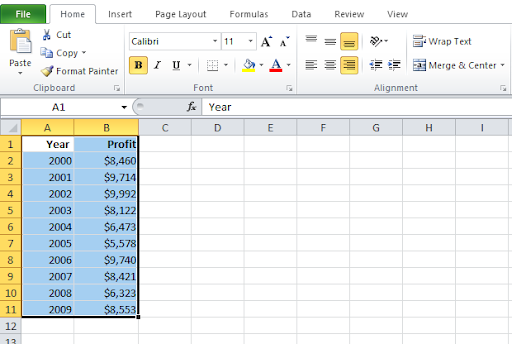
For this guide, we will be considering an example that shows the yearly profit of a particular company from 2000-2009. See the sample data below and follow these simple steps when creating a line graph for your data.
Create and Format Data For Line Graph
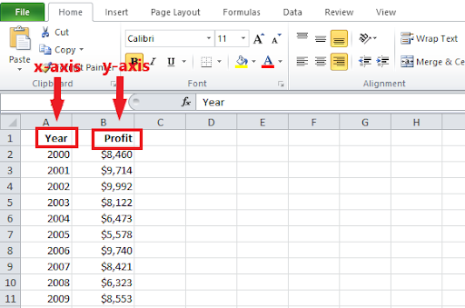
When creating a line chart, you need to have a horizontal (x) axis and a vertical (y) axis. Therefore, when entering your data on the Excel worksheet, you need to indicate these axes by creating 2 columns.
The horizontal axis data should be entered in the left column, while the vertical axis data should be entered in the right column.
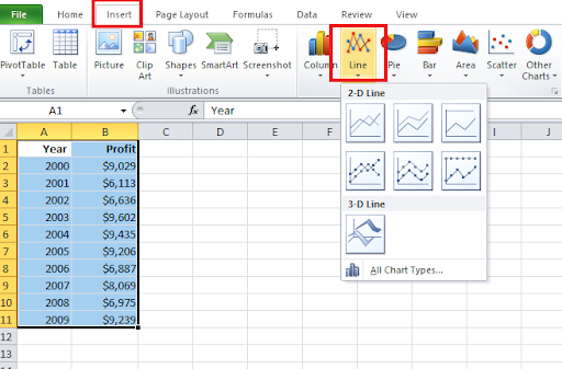
Generate Line Graph
The next thing after formatting the data axis is to generate your line graph. To generate your line graph, highlight the cells containing your data.
Navigate to the Insert tab on the menu, then click on Line to create a line chart for your data.
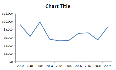
Congratulations! You’ve successfully created a line graph in Excel.
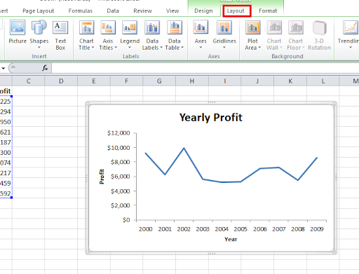
Customize Line Graph
You can further customize your line graph by changing themes, editing labels, title, axis, etc. To do this, click on your graph, then on Layout in the Excel application menu. Feel free to customize your graph as you please.
Line Graph Applications — Practical Examples & Solutions
Below are some examples of the line graph and how it can be used to solve practical problems.
Problem 1: John registered for a 1000km car race with his newly gifted Zenvo STI. This car runs at a speed of 360 km/hr. Calculate how many distances John would have covered in 1.5 hours.
Solution: Let us formulate a table of values correlating the distance traveled by John and the time it took.

Drawing the line chart with the tabulated tables, we have:
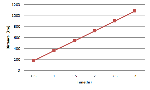
As illustrated below, we can easily calculate the required values with our generated line chart in Excel. To determine the distance John would cover in 1.5 hours, you need to move your cursor to the point where the time is 1.5 hours. We can generate our solution by merely hovering on the point.
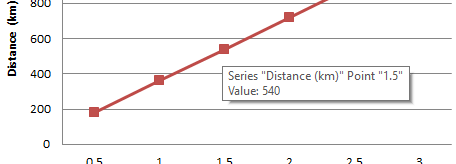
Hene, John will cover 540 km in 1.5 hours.
Problem 2: Bryan decided to also register to compete in the car race with John. So, he borrowed his father's car which can ride at a speed of 400 km/hr. How long will it take Bryan to finish the race?
Solution: Similarly, we formulate a table correlating the distance traveled by Bryan and the time it took. Since Bryan will be racing with John, we extended the existing table from Solution 1 to include Bryan.
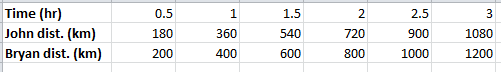
From our generated line graph, we can easily determine how long it will take Bryan to finish the 1000km race.
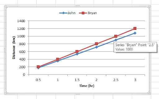
Therefore, it will take Bryan 2.5 hours to finish the 1000 km race.
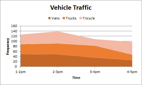
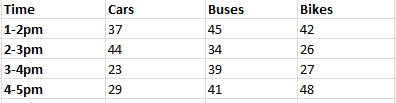
Problem 3: The traffic situation in X-City is getting worse, and it is high time a solution was offered. The company hired to work on the project took a survey of the estimated amount of vehicles that move on the road daily and for various intervals.
The result of this survey is illustrated in the table below.
Construct a line graph to visualize the data. Hence, determine the vehicle with the highest frequency and that with the lowest frequency.
Solution: By visualizing our graph using Excel, we have
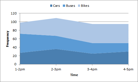
By merely looking at the image above, we can easily conclude that Bikes are of the highest frequency while cars are of the lowest frequency.
How to Collect Line Graph Data with Formplus
Easily collect line graph data using Formplus in these few easy steps.
Build Data Collector
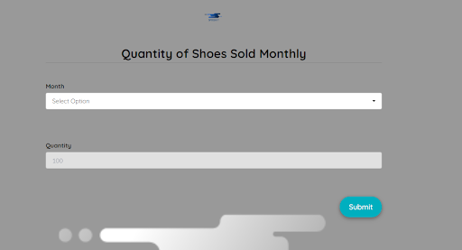
For this illustration guide, we will be building a line graph data collector that collects the number of shoes sold monthly by a small fashion outlet.
- Login or Create a Formplus account for free in 2 seconds.
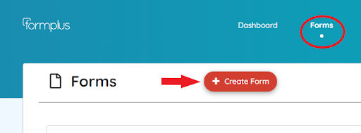
- Go to the Forms in the menu, then click on Create Form
- Go to the form builder menu, then click on the Choice Options dropdown.
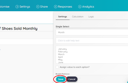
- Click on Single Select to create a form field.
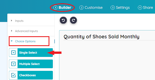
- Edit the form field as you please, then click the Save button.
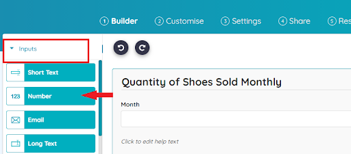
- Add another form field that will enable you to collect the number of shoes sold in a month by clicking on the Inputs section.
Customize Your Data Collector
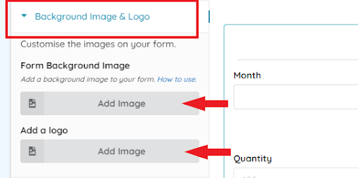
The Customise menu allows you to beautify your forms and give it your brand identity.
- Click on Background Image & Logo to add a background image and business logo to your data collector.
- Use the other options on the menu to further beautify the data collector.
- You can also use the custom CSS feature.
Start Collecting Line Graph Data
Save your data collector and share it with respondents by going to the Share menu. You can also generate a custom link and a QR code for your data collector.
Uses of Line Graph
- It shows the changes that occur on data over a designated period of time. They are great for showing trends chronologically and can easily be interpreted at a glance.
Business owners use it to track profits and sales, it is used in the stock market to indicate price, bloggers track their website traffic using a line graph, etc. This is because it shows us the trend over time and helps to plan for the future.
- It can be used to compare changes between 2 groups of data over the same period of time. For example, we can use a line graph to measure the growth rate of 2 different plants placed under the same condition for a period of time.
This can be effectively measured using a line chart irrespective of whether they are of the same species or not.
- It is more efficient to use when smaller changes exist between the different groups of data under consideration.
- It can show both positive and negative values. This can be very useful when dealing with temperature.
For instance, when measuring the temperature of a place throughout the year, we realize that it may drop to a negative value during winter.
Disadvantages of Line Graph
- It can only be used to visualize data over a short period of time.
- It is not convenient to plot when dealing with fractions and decimals.
- Plotting multiple line graphs will make the chart look cluttered, especially when the graphs intersect. It is advised not to group more than 4 lines on a single chart so that it does not become uneasy to interpret.
- Irregular class intervals may give inaccurate insights. In order for the lines to give accurate insights into the data, the line chart has to be plotted in equal intervals.
Even when the class interval is even, some important patterns could be masked if the interval is too wide.
Conclusion
In experimental sciences, data collected during an experiment is usually visualized using a chart. There are different graphs used to visualize data and the line graph is only one out of them.
The conflict in most cases is knowing when and how to use different data visualization methods. One common thing about all the methods is that before they can be used, the data needs to be in a tabular format.
The table properly sorts the data and makes it easy to visualize. It is, however, important to note that the table is also a method of visualization just like the line chart.