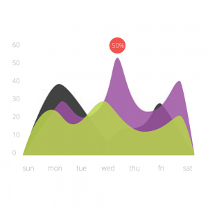
When studying data trends over time, we are sometimes more interested in the collectiveness of the data, rather than the individuality of each data point. In this case, an area chart or graph is used for data visualization.
Area charts give a sense of summation to the quantitative data by visualizing the data in terms of the aggregate area covered by the set of points. This is done by shading the area below the line chart and in between two line charts
This article will be detailing what an area graph really is, including its types, examples, and how to create area graphs using excel.
What is an Area Chart?
An area chart is a data visualization method that collectively measures the rate of change of a variable or group of variables over a period of time. It measures the trends of data over time by filling the area between the line segment and the x-axis with color.
In some cases, when dealing with multiple line segments, the chart is drawn by coloring the area between two consecutive line segments. There are, however, two different ways of drawing an area chart.
It can be drawn with data points overlapping each other, or with data points stacked upon each other. An area chart to the line chart with the distinctive feature being the filling done in-between the x-axis and the line segment.
Features of an Area Chart
There are 5 main characteristics of an area chart, namely; the chart title, key, label, scale, and chart area. In this section, we will be highlighting each of these features using a sample area graph as a guideline.
Consider the area chart below which illustrates the number of part-time and full-time students that attended a school between 2015 and 2019.
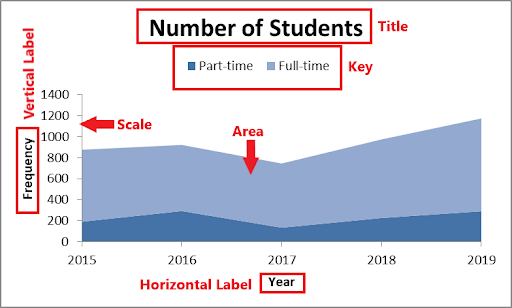
- Title
The title of an area chart is usually a brief definition of the data represented on the area graph. It gives an insight into the kind of data being visualized and the purpose of the data analysis.
In the illustration above, the title of the area graph is “Number of Students”. With this title, we can easily depict that the area chart is visualizing data on the number of students.
This is, however, not sufficient to determine some specifics, like the kind of students under evaluation and also where the student sample was taken from (e.g. a school, class, etc.).
- Labels
We have 2 axes on an area chart, namely; the horizontal axis and the vertical axis. Each of these axes is labeled to give further insight into the kind of data being visualized on the chart.
Labels give more information about the data that was used for plotting the area chart. After getting a hint from the title that we are dealing with the Number of Students, the horizontal label, Year and vertical label, and Frequency inform us that we are studying the number of students over the years.
In other words, labels can be seen as graph subtitles, which go on to further summarize some important details about the graph.
- Scale
The scale of an area chart is the annotation of the x and y axes, which shows how each point on the graph is being defined. It indicates the amount of data each unit on the horizontal and vertical axes represents.
That way, an individual can easily read the area chart and use it to determine what the trend is at a particular point in time. With the scale on the graph above, we can easily tell that the total number of students in 2016 is 922.
In this case, each unit on the horizontal axis represents 1 year, while each unit on the vertical axis represents 200 students. The scale is what helps us understand this.
- Key
In an area chart, we can have more than one group of data being visualized. Therefore, in order to properly visualize this data, the area covered by each group on the graph is shaded using different colors.
This will help differentiate the different groups represented on the graph. However, the key is what helps us understand what each color indicates.
From the above example, the key made us understand that there are 2 groups of students being evaluated in the dataset, namely; Part-time students and Full-time students. The part-time students are represented using a deep blue, while full-time students are represented with a lighter shade of blue.
- Chart Area
In an area graph, the chart area can be seen as the body of the graph. It gives a detailed description of the data that is being evaluated including each point on the data, the line segment generated from the data, and the area of the line segment.
The area or chart area is the part of an area graph that answers any question an individual may want to ask about the data. It helps to interpret the trends at a glance, draw correct conclusions from the behavior of the chart area, and make good decisions for the future.
For example, the chart area in the diagram shows that the number of students in the school reduced between 2016 and 2017, after which it increased again between 2017 and 2019. We can also conclude that full-time students are more than part-time students.
This information will give rise to the need to answer the question of what caused the major decline in the number of students between 2016 and 2017. Understanding the cause of the decline will help make better decisions by avoiding the same occurrence in the future.
Types of Area Chart
There are 6 main types of area charts, namely; simple area chart, stacked area chart, 100% stacked area chart, 3-D area chart, stacked 3-D area chart, and 100% stacked 3-D area chart.
In this section, we will be highlighting these 6 types of an area charts and will be showing you a step-by-step guide on how to create each of them using Excel.
Before going into highlighting the different types of an area graphs, let us consider the following Excel table. This table shows the record of visitors that come into an organization daily, from Monday to Wednesday.
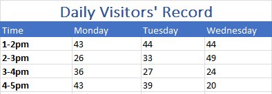
We will be using this example table to create each of the following types of area charts using Excel.
Simple Area Chart
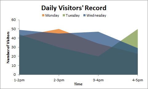
Simple area charts are constructed so that the colored segments or chart areas are overlapping each other. The data plots are placed on top of one another in a way that some of the colored areas on the graph intersect.
It is advised that when constructing a simple area graph, the data with the smallest values should be plotted last so that it will remain visible on the chart. If plotted first, the larger area segment may cover it up and make it invisible.
Alternatively, you can increase the transparency of the graph so that none of the area segments are hidden. Follow these easy steps to see how it is done.
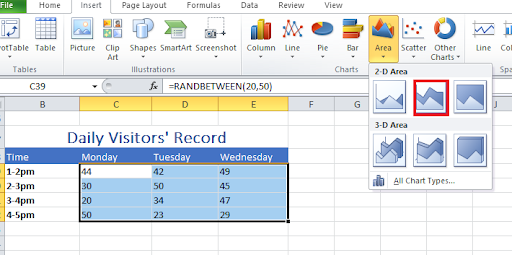
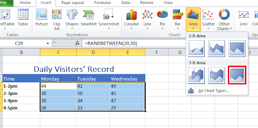
- Enter your data into Excel Sheet.
- Highlight your table data from Monday to Wednesday as shown in the figure below.
- Click on Insert>Area>Area.
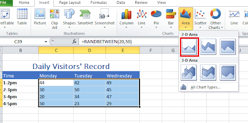
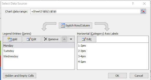
- Right-click on the Plot Area, click Select Data and edit the horizontal axis data by entering the time scale.
- Right-click on the area segment, click Format Data Series>Fill>Solid fill and edit the transparency. Do this for each area segment.
- Save and click on Layout where you can edit other things like title, labels, key, etc.
Stacked Area Chart
A stacked area chart is a type of area graph that visualizes data plots by joining groups of data together in such a way that each new group is an extension of the previous one. The data plots or colored segments on a stacked area graph are placed on top of each other.
That is why, when reading the values on the y-axis of the top segment on a stacked graph, you need to subtract the plot value from the value of the previous segment. Consider the stacked graph below, showing the number of visitors received in an organization daily, from Monday to Wednesday.
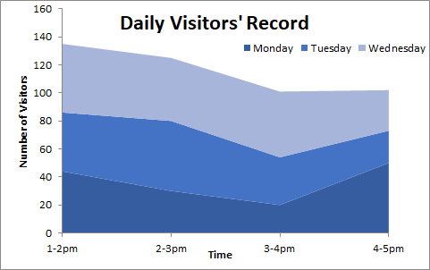
To obtain the number of visitors received between 2-3 pm on Wednesday, we subtract 80 from 125. So, we have 125-80 = 45 visitors received between 2-3 pm on Wednesday.
To construct this stacked area graph using Excel, follow these simple steps.
- Highlight your table data as explained above.
- Click on Insert>Area>Stacked Area.
- Right-click on the Plot Area, click Select Data, and edit the horizontal axis data as explained above
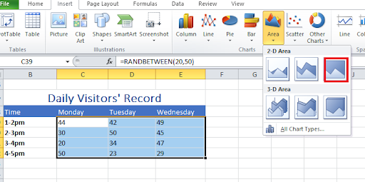
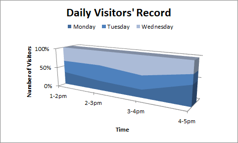
100% Stacked Area Chart
This is an extension of the area chart. The 100℅ Stacked area chart is just like the stacked area chart, but in this case, the scale of the vertical axis is represented as a percentage of the total data.
In this type of area chart, the area segment usually takes up the whole of the chart area. It is great for calculating the percentage estimate of a data trend.
When reading a trend on the 100% Stacked Area Chart, further calculations are needed before conclusions can be made. Consider the graph below.
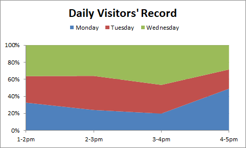
From this graph, we can deduce that the percentage number of visitors recorded between 1 and 2 pm on Wednesday is 100%-64℅ = 36℅ of the visitors. To get the exact number, we calculate 36% of 125 (Total number of visitors between 1 and 2 pm) = 45 visitors.
Construct this 100% stacked area graph through the following steps.
- Highlight your table data as explained above.
- Click on Insert>Area>100% Stacked Area.
- Right-click on the Plot Area, click Select Data, and edit the horizontal axis data as explained above
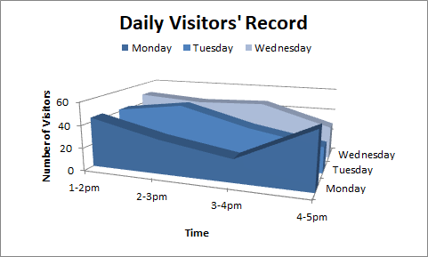
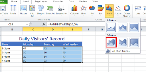
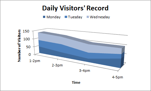
3-D Area Chart
As the name implies, a 3-D Area Chart is an area chart that displays the area segment of a group of data in 3 dimensions. Similar to a simple area chart, it can also be called a 3-D simple area chart.
The difference, however, is that the 3-D area chart has 3 axes, namely; the x, y, and z axes. Also, as seen in the diagram below, one may not need a key to interpret a 3-D chart.
This is because of the labeling on the z-axis.
Construct a 3-D Area Graph in these few easy steps:
- Highlight your table data as explained above.
- Click on Insert>Area>3-D Area.
- Right-click on the Plot Area, click Select Data, and edit the horizontal axis data as explained above
- Change the rotation of your graph by clicking on the graph, then Layout>3-D Rotation.
3-D Stacked Area Chart
This is a 3-dimensional area chart that visualizes the data plots by stacking each colored area segment on top of each other. The 3-D Stacked Area Chart and the Stacked area chart have some common features.
The difference, however, is the 3-dimensional display of the former. Therefore, one can see the top and side views of the area chart.
Consider the sample diagram below.
To construct this 3D stacked area chart using Excel, follow these simple steps.
- Highlight your table data as explained above.
- Click on Insert>Area>3-D Stacked Area.
- Right-click on the Plot Area, click Select Data and edit the horizontal axis data as explained above.
- Change the rotation of your graph by clicking on the graph, then Layout>3-D Rotation

3-D 100% Stacked Area Chart
The 3-D 100% stacked area chart is an extension of the 100% stacked area chart. This chart type uses the percentage to stack area segments on top of each other in 3 dimensions.
Follow these simple steps to construct a 3-D 100% stacked line graph using Excel.
- Highlight your table data as explained above.
- Click on Insert>Area>3-D 100% Stacked Area.
- Right-click on the Plot Area, click Select Data, and edit the horizontal axis data as explained above.
- Change the rotation of your graph by clicking on the graph, then Layout>3-D Rotation
When to Use an Area Chart
- During Collective Data Analysis
Area charts add a sense of volume to your data by grouping the data points together and visualizing them as the area of a particular line segment, rather than a line segment of individual data points.
- Investigating the Contribution of a Sample Dataset to The Total
Consider the case whereby the score of a student in each subject over the years is being evaluated to determine his strength. With an area chart, the strength can be detected at a glance by looking out for the segment that takes the most volume.
- Trend Analysis
Area charts give a clear picture of each group’s performance trends both separately and collectively. In the example above, we can easily deduce that the number of visitors is highest on Tuesday between 2 pm and 3 pm.
Area Chart vs Line Chart Difference & Similarities
Line Charts and Area Charts are both used for data visualization. However, they also have some major differences that help us recognize them and also know where to use them.
Differences
- Features
Some line graph types indicate the data points used in drawing the line segment on the plot area. However, area charts do not indicate these data points on the graph.
Also, although area charts are drawn by filling the space in between the line segment and the x-axis, it does not indicate the line segment. The different segments on the area chart are clarified through the difference in color.
- Color
In an area chart, the room between each line segment and the x-axis is filled with color, while in a line chart, it is left empty.
- Origin/Starting Point
The vertical or y-axis of an area chart starts from zero in all cases, while that of a line chart does not necessarily have to start from the origin.
Similarities
- Patterns
Area charts and line charts have similar patterns. The slope and direction of these 2 charts are usually the same when constructed with the same data set.
- Features
Line charts and area charts have some similar characteristics, including the chart title, horizontal & vertical labels, and scale. Similar to area charts, compound line graphs also have a key.
- Use
They are both used to display trends over and analyze trends over a period of time.
Advantages of Area Chart
- It helps to emphasize the magnitude of data, by filling the area between the line segment and the x-axis.
- It is visually appealing and easy to read, sometimes at a glance.
- It gives a clear comparison of different groups of datasets
- Easy to label.
- Highlight information by visually separating each area segment.
Conclusion
Area charts are an extension of the line charts, which is why they have a lot in common. In fact, when manually constructing an area graph, you need to first construct a line graph before shading the area between the line segment and the x-axis.
However, the main distinctive feature of an area chart is the filling or coloring done in between the line segment and the horizontal axis. Although area charts can be used in many varied ways, they are best used to show multiple groups of data over time.
Therefore, when visualizing multiple datasets using area charts, you should consider bringing the most important dataset to the bottom of the graph, and make it stand out with a distinct color. Also, tiny values should be grouped together to avoid having a cluttered chart.